

Apptimize is an A/B testing tool that specializes in mobile applications. I was brought onto the product team to help expand their product beyond mobile into the realms of web and server testing and to redesign certain elements, such as their dashboard.
As I learned the tool, I discovered that the Apptimize web application was full of design inconsistencies, aesthetic dissonance, and most importantly, had an unnavigable, chaotic visual hierarchy. To approach the dashboard redesign, I decided to first dissect the site's architecture and to reassemble it to be more intuitive.
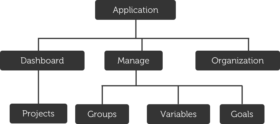
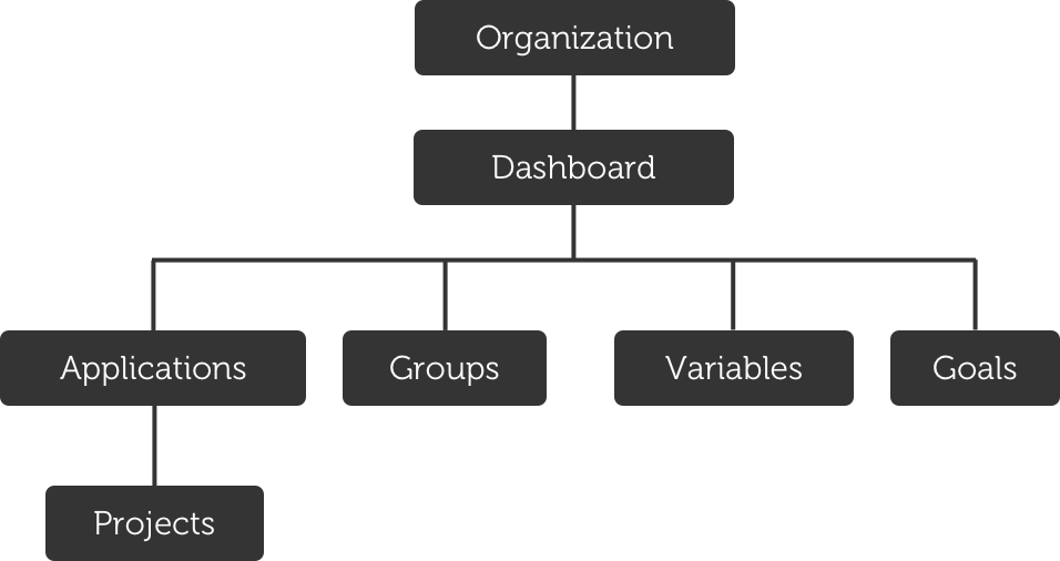
Conceptually, the information architecture was very simple:
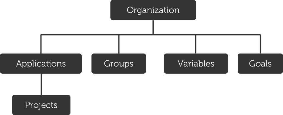
The organization that the users signs up with was the highest level. Under that, multiple applications could be added. On that secondary level, there were other within-organization elements (Groups, Variables, Goals) that apply across all apps in the organization.
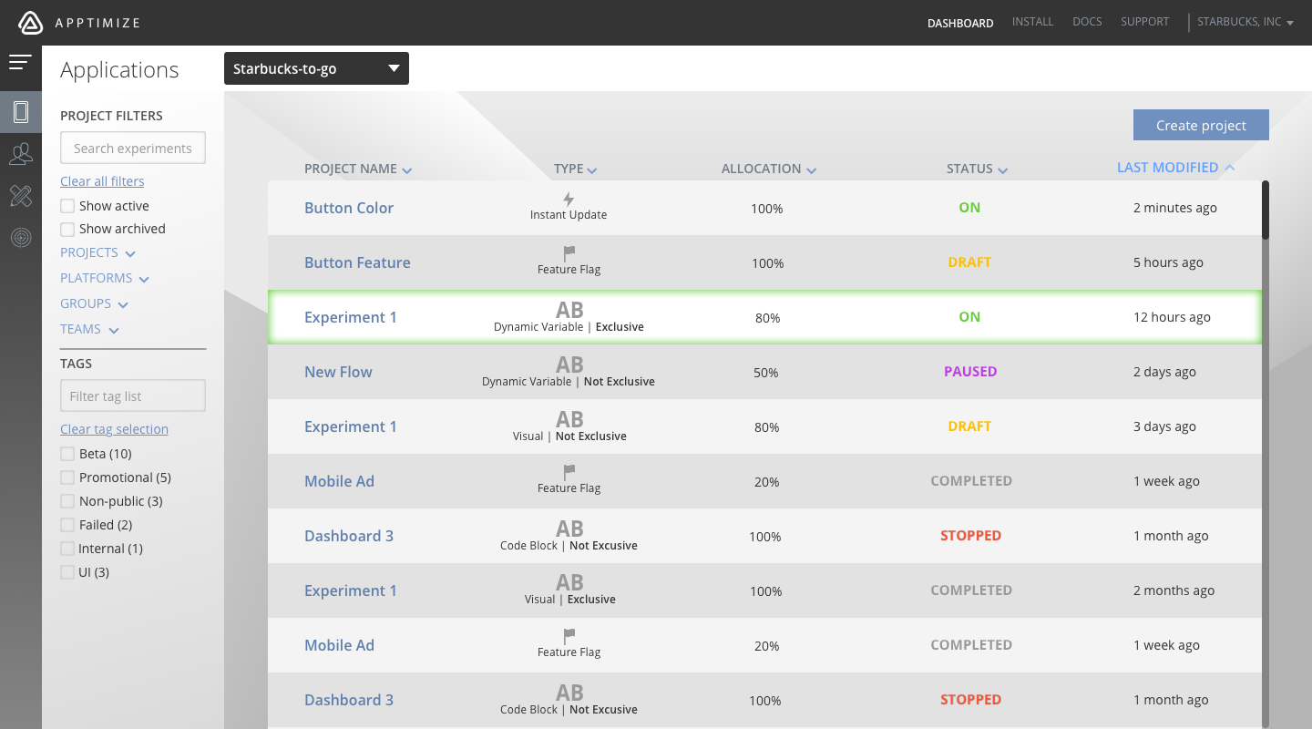
The current visual hierarchy, however, had a single "Application" as the highest level. To switch between other apps, users needed to go into "Settings," which is a mix between organizational and application functions. Other organizational functions (Groups, Variables, Goals) appeared to apply only to this one application.
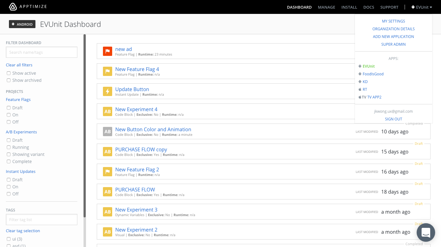
The current dashboard:
First, I conceptually reorganized the hierarchy to be more consistent with the information architecture:
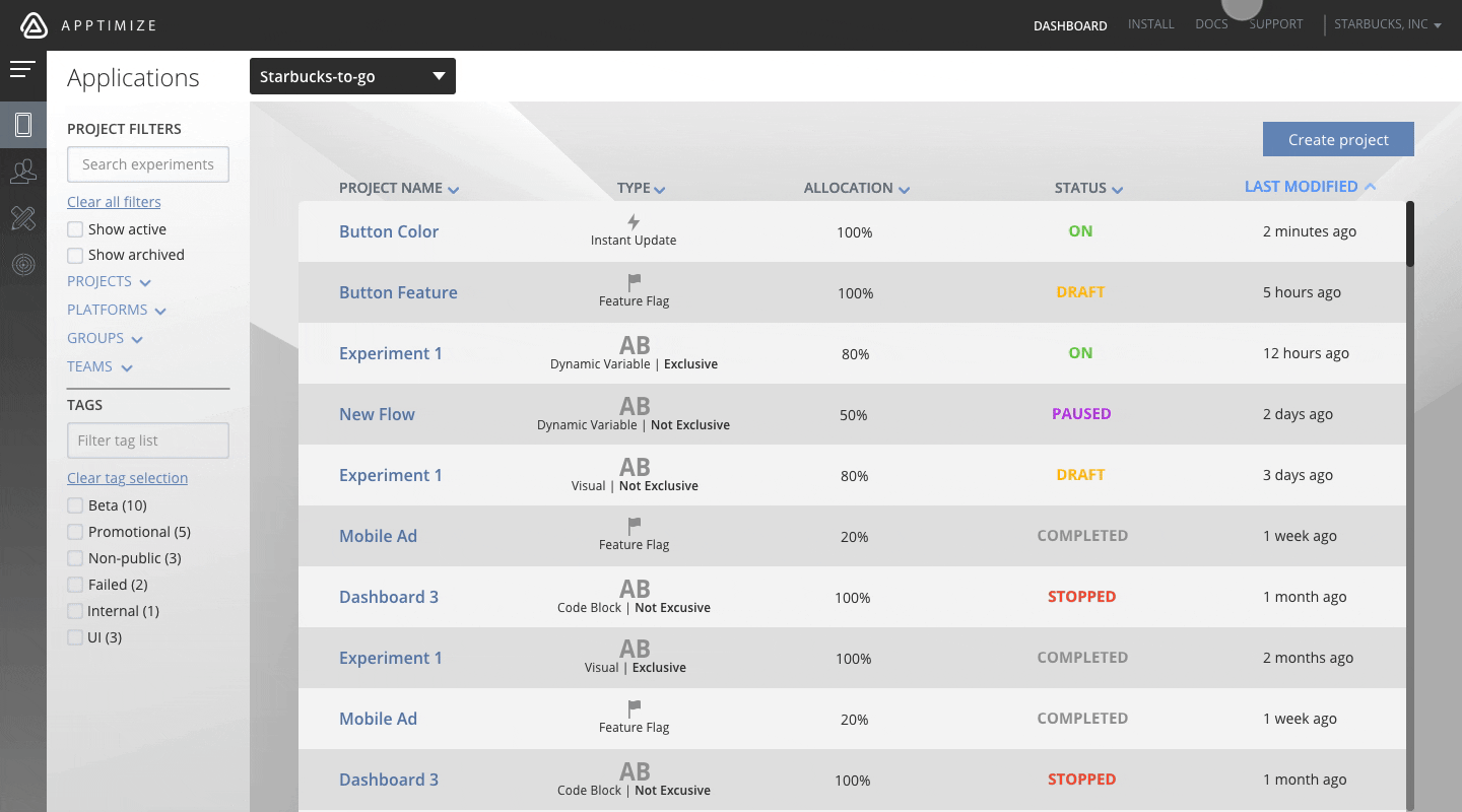
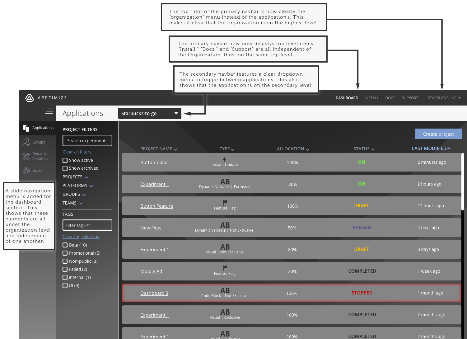
Next, I redesigned the dashboard screen to incorporate these changes. I tried to visually keep it consistent with the Apptimize brand (white on black logo).
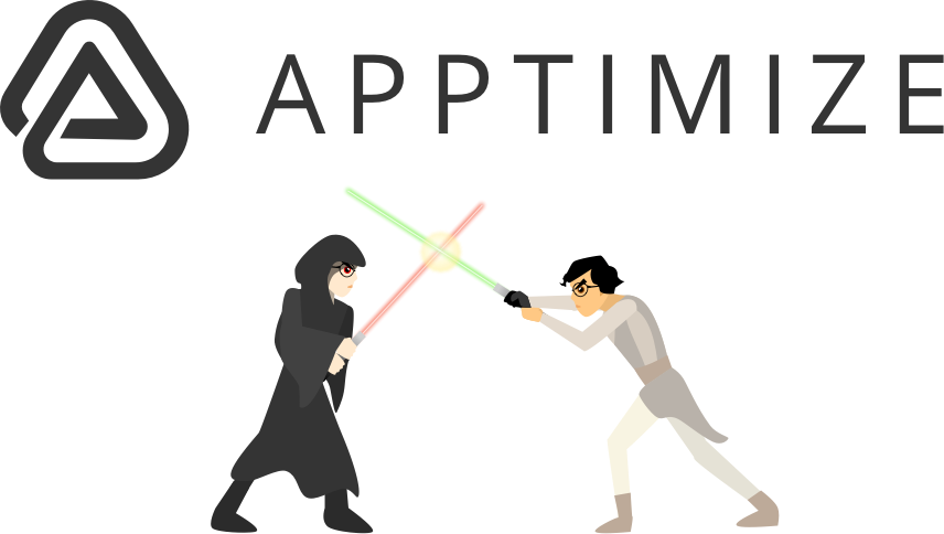
After doing some usability testing, I found that most users thought the dark theme seemed a bit evil and hard to read.
For my coup de grâce to end the chaos, I decided to reject the Sith branding and embrace the Jedi Order by reskinning the design.